Page 4 of 11
Re: OAUSA Logo Suggestions
Posted: Fri May 30, 2008 4:14 pm
by BoBoNel
i like bigdaves idea with the circle. but thats my 02 cents......when i have time i'll give it more thought..........and maybe some ideas. i'm not very creative.
Re: OAUSA Logo Suggestions
Posted: Sat May 31, 2008 12:14 am
by hmfigueroa
hmfigueroa wrote:big dave wrote:Hector, do you think you can draw my logo with whatever program you are using?
OK I am lost, I have tried incorporating the suggestions here, was yours the hand drawn one that I cannot seem to find at the moment.
If so, can you post it up again, I have lost track. Sorry.
I will do what I can.
OK that was strange, I can see your example on this machine but not my other machine. I will post up your idea when I put it together. I will need to figure out what happened as this it truly strange.
Re: OAUSA Logo Suggestions
Posted: Mon Jun 02, 2008 10:10 am
by hmfigueroa
hmfigueroa wrote:hmfigueroa wrote:big dave wrote:Hector, do you think you can draw my logo with whatever program you are using?
Big Dave Here is what I have for you.
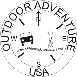
- bigdave.gif (17.35 KiB) Viewed 19136 times
Re: OAUSA Logo Suggestions
Posted: Mon Jun 02, 2008 11:56 am
by hmfigueroa
Hey Everyone Vote on a Motto . . . .
Here is the current Motto leaders!
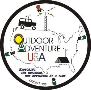
- oausa-4.gif (19.02 KiB) Viewed 19125 times

- oausa-4a.gif (18.53 KiB) Viewed 19056 times
Re: OAUSA Logo Suggestions
Posted: Mon Jun 02, 2008 2:49 pm
by big dave
I like what youve done with mine, but i like yours better

Re: OAUSA Logo Suggestions
Posted: Wed Jun 11, 2008 1:18 pm
by hmfigueroa
Based on forum traffic related to the group Motto, I have replaced the text in the proposed logo, If anyone has any input as to the design, please put it forward.
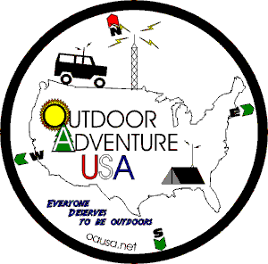
- oausa-4b.gif (7.2 KiB) Viewed 19032 times
- oausa-4b.gif (7.2 KiB) Viewed 19032 times
Re: OAUSA Logo Suggestions
Posted: Wed Jun 11, 2008 11:41 pm
by cruiserlarry
I know I'm going to get flamed here, but I find these logos to be a bit "busy". While they are very well done, they will be hard to reproduce in detail in smaller sizes, difficult to recognize at a distance, and very hard to reproduce on hats, shirts, etc., IMHO. No insult intended, as I know a lot of hard work has gone into them so far - but I think a much simpler, bolder design is needed to make sure it is easy to see and recognize when seen on a vehicle, shirt, hat, or flyer. If you look at the most successful logos oout there, you'll see very little detail and bold shapes - Coca-Cola, Pepsi, Nike, Apple, AT&T, FedEx, etc., even the Olympics use very simple logos that are easily recognized.
The sole purpose of a logo is recognition - let the site provide the details once the logo gets them to log in...
Re: OAUSA Logo Suggestions
Posted: Thu Jun 12, 2008 12:08 am
by hmfigueroa
No flames from me,
Some of my earlier editions were more simple, I agree that these are somewhat busy. They are to illustrate what can be incorporated. These are not time consuming nor difficult to do with the right stuff. These are honestly glorified doodles. I can add and remove any of the components with a click.
I was going forward with ideas to stimulate conversation and it has died down somewhat. I want and have specifically requested input from the membership. I am willing to draw up the ideas of others and am ready for input on any of the designs.
Re: OAUSA Logo Suggestions
Posted: Thu Jun 12, 2008 6:23 am
by BlueFJ
How about making the "A" in Adventure the radio tower instead of a tree, thus eliminating the need for a tower elsewhere and minimizing the "busyness" of the design?
Re: OAUSA Logo Suggestions
Posted: Thu Jun 12, 2008 5:32 pm
by BoBoNel
good idea blue.......you've got the O (which you can use as the "circle"....the A as the tower.....USA somewhere on there) simple design, name on there ........ OAUSA.......
bumping up the thought process.