Page 5 of 11
Re: OAUSA Logo Suggestions
Posted: Thu Jun 12, 2008 5:45 pm
by cruiserlarry
I suggest a second circle concentric to the first, with "OUTDOOR ADVENTURE U.S.A." between the inner and outer circles. Inside the inner circle, a JEEP (or my favorite, an FJC

), an antenna tower, and a tent each taking up about one third of the inner circle equally (and proportional to each other). The map of the USA is redundant, IMO, and takes away the focus of the activity symbols. This way, you'll have simple bold representations of the activities, and the name spelled out for all to easily see...
...now if I could only work a paint program...

Re: OAUSA Logo Suggestions
Posted: Thu Jun 12, 2008 6:53 pm
by NotAMog
I had a boss, now retired, who designed logos as a hobby. He gave me some pointers when I was trying to design a logo from our local community orchestra a few years ago. I also lived through the great worm vs meatball debate while working at NASA (
http://www.nasawatch.com/worm.watch.html" onclick="window.open(this.href);return false;).
Here are a few things to think about for logos -
Simplicity is good - If the logo is too busy or complicated it's hard for the eye to recognize it quickly, espcially if its a sticker on the side of moving vehicle. The NASA worm was about as simple as you can get. The NASA meatball is very busy with lots of small detail but it does have some simple strong elements that make it easily recognizable. It would be good for the OAUSA logo to have some simple strong element that is easily recognizable as well. I've seen many off road club logos on vehicles at events that can only be recognized from a maximum of 3 feet away while standing still.
Scalability - Think of how the logo will look on letter head or the side of a building. Once again the NASA worm was practically infinitely scalable while the meatball looses detail on letter head and is difficult to render very large because it's too busy.
Cost to reproduce - A logo that is very complex and relies on many colors to convey information becomes expensive to reproduce. Think about the Apple logo when they simplified it and removed the color bands. The cost of silk screening or embroidery increases with each additional color. A logo that works well in both color and black and white is great.
Purpose - A logo should be designed for a multitude of uses. Something like a shoulder patch should incorporate the logo but since it serves a specific purpose it's much easier to include other appropriate information, heraldic devices, etc.
Re: OAUSA Logo Suggestions
Posted: Thu Jun 12, 2008 7:13 pm
by DaveK
Bruce:
Are either you or your boss available for consulting!
Re: OAUSA Logo Suggestions
Posted: Fri Jun 13, 2008 9:47 pm
by hmfigueroa
Cruiser larry's idea
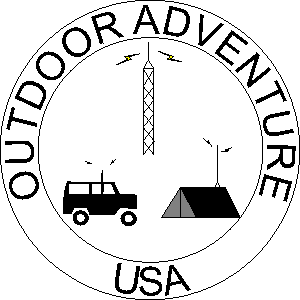
- oausa5.gif (3.91 KiB) Viewed 21183 times
Comments Please.
Edit . . .

dagnabbit I accidentally set the graphic to have a transparency I will fix this by monday afternoon.
Re: OAUSA Logo Suggestions
Posted: Sat Jun 14, 2008 1:07 am
by cruiserlarry
hmfigueroa wrote:Cruiser larry's idea
oausa5.gif
Comments Please.
hmfigueroa-
Thank you for taking the time to mock up my suggestion. While there might need to be changes to font / proportion / graphic representation, you got the gist of what I was trying to present - I appreciate you taking the time to do this.

Re: OAUSA Logo Suggestions
Posted: Sat Jun 14, 2008 7:33 am
by Cnynrat
I like Larry's idea, and I would guess it might be easier to reproduce on stickers, T-shirts and the like. As Larry said simpler is often better in that regard. I wonder if it would be too much to add back the compass cardinal points around the circle - that was a feature I kind of liked about the other design. I'm thinking they could go around the outside of the outer circle and not overly complicate the design.
Re: OAUSA Logo Suggestions
Posted: Sat Jun 14, 2008 9:24 am
by OLLIE
Cnynrat wrote:I like Larry's idea, and I would guess it might be easier to reproduce on stickers, T-shirts and the like. As Larry said simpler is often better in that regard. I wonder if it would be too much to add back the compass cardinal points around the circle - that was a feature I kind of liked about the other design. I'm thinking they could go around the outside of the outer circle and not overly complicate the design.
I agree. The new version is much easier to produce and if the compass points could be added I think with minute adjustments it would be what we are looking for.
Re: OAUSA Logo Suggestions
Posted: Sat Jun 14, 2008 5:06 pm
by traveltoad
Cnynrat wrote: I'm thinking they could go around the outside of the outer circle and not overly complicate the design.
Or just inside the inner circle to not conflict with the logo text.
Re: OAUSA Logo Suggestions
Posted: Sat Jun 14, 2008 8:57 pm
by BoBoNel
hmfigueroa wrote:Cruiser larry's idea
oausa5.gif
Comments Please.
Edit . . .
dagnabbit I accidentally set the graphic to have a transparency I will fix this by monday afternoon.
I LIKE THIS IDEA. GOOD WORK AND THANKS FOR BEING CREATIVE. 
Re: OAUSA Logo Suggestions
Posted: Sat Jun 14, 2008 10:50 pm
by cruiserlarry
I like the idea of the compass points inside the inner circle. I would also suggest a thicker (bold) font for Outdoor Adventure USA, with the spacing such that the USA is centered on the bottom, and the rest of the letters take up the remaining space proportionally. Maybe a green color between the circles, and a beige / tan color under the icons / compass. (Wish I could work the paint program, but I seem to make a mess...

).