Page 6 of 11
Re: OAUSA Logo Suggestions
Posted: Sun Jun 15, 2008 9:18 am
by NotAMog
Here are a couple of ideas my old boss Dave came up with -
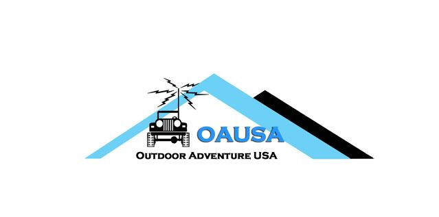
OAUSA Logo 1
OAUSA Logo 2
Of the two I prefer Logo 1 but with a green mountain chevron rather than blue.
Re: OAUSA Logo Suggestions
Posted: Sun Jun 15, 2008 10:51 am
by cruiserlarry
I like NotaMog's OAUSA logo #1 - simple, direct, easy to read, easy to see. I also think it would look better in "earth" colors, such as green for the mountain chevron and maybe brown for the "OAUSA" lettering.
Nice job...
Re: OAUSA Logo Suggestions
Posted: Mon Jun 16, 2008 6:51 am
by mbisson
I like no. 1. But could you put a .net after Outdoor Adventer USA?
Re: OAUSA Logo Suggestions
Posted: Mon Jun 16, 2008 7:51 am
by sdnative
NotAMog wrote:
OAUSA Logo 1
Wow, that's nice. Very simple, but grabs you. Good job. Only problem I see is that people seeing that may think "oh, another jeep club", even though we're much, much more. Hiking, mountian biking, kayaking, etc. Heck, even Frogeye's chili is an outdoor adventure in itself...

Re: OAUSA Logo Suggestions
Posted: Mon Jun 16, 2008 11:06 am
by hmfigueroa
Updates on Larry's Design
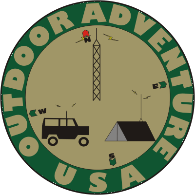
- oausa5a.png (26.58 KiB) Viewed 16964 times
Re: OAUSA Logo Suggestions
Posted: Mon Jun 16, 2008 1:22 pm
by cruiserlarry
Nice update, Hector. Couple of other suggestions, since you are being so generous with your time

:
Maybe make the compass points a little larger, and the icons in the circle a little smaller, so that they don't "overlap"...
...now I have to get back to my coloring book...

Re: OAUSA Logo Suggestions
Posted: Mon Jun 16, 2008 3:56 pm
by hmfigueroa
cruiserlarry wrote:Nice update, Hector. Couple of other suggestions, since you are being so generous with your time
:
Maybe make the compass points a little larger, and the icons in the circle a little smaller, so that they don't "overlap"...
...now I have to get back to my coloring book...
The intent of the overlap was to put the antenna into a dual purpose of antenna and compass pointer, but it is flexible. Also related to the antenna. Some have expressed the thought that we should use an "A" Shaped antenna, My position is that a true ham or radio tower is just that a tower. The "A" is a power tower or oil derrick, depending on how you top it.
Edit :I will need to fix the RF emissions on the truck, an is anyone else getting the white dots all over the place? I will repair that tomorrow.
Re: OAUSA Logo Suggestions
Posted: Mon Jun 16, 2008 4:05 pm
by hmfigueroa
On the topic of antennas, I am not certain we even need a tower antenna as amateur radio as it relates to off-road does not require any infrastructure support such as a repeater. I admit it does greatly enhance communications but repeaters are not necessarilly mandatory.
Re: OAUSA Logo Suggestions
Posted: Mon Jun 16, 2008 5:27 pm
by DaveK
hmfigueroa wrote:On the topic of antennas, I am not certain we even need a tower antenna as amateur radio as it relates to off-road does not require any infrastructure support such as a repeater. I admit it does greatly enhance communications but repeaters are not necessarilly mandatory.
Hector:
You are correct that repeaters are not necessary. But, there are very few places in the USA that don't have some form of repeater coverage. Knowing where the repeaters are and how to get into them, even in the remotest of places, can be a life saver. The ability to do both repeater and simplex forms of communication is one of the benefits of the 2m radio (and 440 and the others that use repeaters).
On a related note, please accept our thanks for all of your hard work in creating these ideas. How bout a little more blue color in there!
Re: OAUSA Logo Suggestions
Posted: Mon Jun 16, 2008 6:50 pm
by hmfigueroa
DaveK wrote:
On a related note, please accept our thanks for all of your hard work in creating these ideas. How bout a little more blue color in there!
Thanks Dave


my pleasure.
Sure just pick a color with a little more blue.
http://www.logodesignteam.com/logo-desi ... chart.html" onclick="window.open(this.href);return false;
I'm not trying to be funny, but this may help alleiviate the ping pong way of doing this. I would like to perhaps have some demo copies printed up for the meet and greet. So the quicker we can firm up some designs, the quicker we can figure out a direction to go.