Page 8 of 11
Re: OAUSA Logo Suggestions
Posted: Wed Jun 25, 2008 5:47 pm
by cruiserlarry
It's definitely coming along. I like it much better w/o the tower. Maybe we can add a hiker on the mountain side w/ a handheld - off-roading / camping / hiking...
Re: OAUSA Logo Suggestions
Posted: Thu Jun 26, 2008 4:19 pm
by hmfigueroa
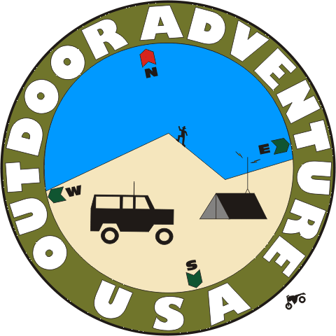
- oausa7b1.gif (29.05 KiB) Viewed 19687 times
Looks like we may have a problem with perspective. Ideas. Oh I still have the motor cycle, if we want to add that.
Re: OAUSA Logo Suggestions
Posted: Thu Jun 26, 2008 4:25 pm
by traveltoad
hmfigueroa wrote:oausa7b1.gif
Looks like we may have a problem with perspective. Ideas. Oh I still have the motor cycle, if we want to add that.
For some reason that I cannot put my finger on the inside picture doesn't feel right to me. I like the two rings, the text, the compass rose... just something about the picture.
I will have to ponder it more...
Re: OAUSA Logo Suggestions
Posted: Thu Jun 26, 2008 5:42 pm
by cruiserlarry
traveltoad wrote:hmfigueroa wrote:oausa7b1.gif
Looks like we may have a problem with perspective. Ideas. Oh I still have the motor cycle, if we want to add that.
For some reason that I cannot put my finger on the inside picture doesn't feel right to me. I like the two rings, the text, the compass rose... just something about the picture.
I will have to ponder it more...
I agree - the compass points and icons inside the circle don't flow.... they just look like individual pieces setting in an area. We may need a more "artistic / impressionistic" interpretation of the symbols to fill the space more fluidly...
Re: OAUSA Logo Suggestions
Posted: Thu Jun 26, 2008 7:53 pm
by NotAMog
Here is another idea from Dave that I'm partial to

From the look of the meet and greet pictures it should feature an FJ Cruiser rather than a Pinzgauer.
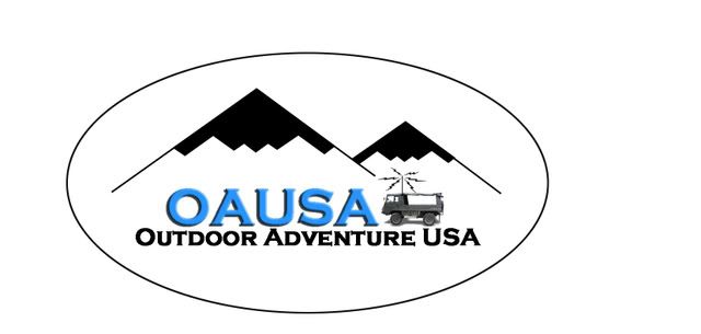
Note the clever tie to the Air Force and the aircraft industry which is a big part of the Antelope Valley.

Re: OAUSA Logo Suggestions
Posted: Fri Jun 27, 2008 12:04 pm
by BlueFJ
Any way to rotate the compass part a bit so it doesn't look like it's rolled to one side?
Re: OAUSA Logo Suggestions
Posted: Fri Jun 27, 2008 12:32 pm
by hmfigueroa
BlueFJ wrote:Any way to rotate the compass part a bit so it doesn't look like it's rolled to one side?
I considered that but decided that much like your avatar the direct rigid 0,90 positioning did not convey a sense of neither movement nor adventure.
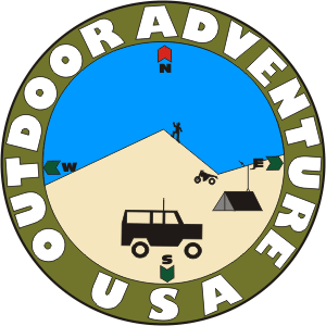
- oausa7b2.gif (17.34 KiB) Viewed 19634 times
I am not opposed to that, I simply do not know where to go. Just about anything is possible, we just need to know what everyones thoughts are. We can move anything anywhere our only issues are trademark or copyrights. If anyone has suggestions we can implement them and put them to the vote. The other issues being complexity for reproduction, cost for reproductions. Those are the concerns that have been raised, and it makes sense to have it convey the soul of the group. But it must not be an undue burden to the group.
Re: OAUSA Logo Suggestions
Posted: Fri Jun 27, 2008 12:44 pm
by BlueFJ
I do like it much better with the compass in an upright position. The crooked compass thing was bugging the heck outta me.
Re: OAUSA Logo Suggestions
Posted: Fri Jun 27, 2008 8:16 pm
by cruiserlarry
The icons are still lost - need much larger truck, tent, and hiker (and I'd lose the motorcycle). The background shouldbe incidental, with the symbols of the different hobbies taking precedence, IMHO. It still seems too busy, too much going on inside the circle...
Re: OAUSA Logo Suggestions
Posted: Fri Jun 27, 2008 10:20 pm
by hmfigueroa
My issue it how do you make the individual icons bigger without making the entire thing too busy, stuff will begin overlapping other stuff. I will do it, and we will see how it comes out.
I guess the compass thing is what seems to gettin the way the most. I will work up those ideas and see what happpens.